Chris Ware's "Jimmy Corrigan: The Smartest Kid on Earth"
Curious.
Beautiful.
Strange.
Frustrating.
Compelling.
These words only begin to describe Ware's graphic novel "Jimmy Corrigan: Smartest Kid on Earth."
The first thing I noticed about "Corrigan" was the way the thick, horizontal text sat in my hands. It felt different. The cover design for the paperback was beautiful and intricate, but very unlike most of the comics I've encountered up to this one. In fact Chris Ware noted that it's shape and size are similar to that of his estranged father's urn (more on that later).
(A Note: If you buy the paperback version of this text, as opposed to the hardcover, be prepared to have your copy fall apart within two or three readings. The binding, whether because of the dimensions or the number of pages, will fall apart on you. I recommend, if you want to keep this book for any amount of time, you fork over the extra cash for the hardcover)
Opening the cover I was greeted by this imposing, complex mass of really, really small text, a diagram of a cat and mouse, and an exam, a multiple choice exam to be exact. What is the purpose of these initial pages...why to help you figure out how to encounter and read "Jimmy Corrigan."
Yeah, directions on how to read it.
What follows is an incredibly frustrating, but ultimately rewarding journey into the shambles of a life of Chicagoan Jimmy Corrigan as he meets his father for the first time. The text is complicated by multiple plot lines involving Corrigan's family ancestors and how they were unfit or absent fathers.
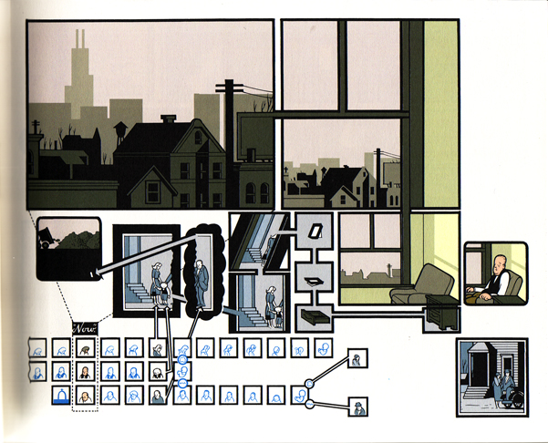
"Corrigan" looks like it could be a graphic design manual as well as be a graphic narrative. It's often difficult to know which way panel sequences should be read (Ware often includes arrows to direct readers) and the incredible amount of small detail and sometimes smaller text can leave the reader frustrated. But I found when you gave up trying to asses meaning to every small part, even gave up on reading or dissecting some of the diagrams or impossible to read text, that was when "Jimmy Corrigan" began to make sense. Ware has created a graphic narrative that is not so much about the story but about the mood. Its complex nature is representative of a family's confusing existence. This is also an increasingly silent text. There are a majority of panel and panel sequences without text, but the silence is so fitting. It works to make us uncomfortable, which helps us to relate to and understand the main character Jimmy Corrigan, and it also helps us to understand the importance and detrimental affect of over a century of silent father/son relationships.Another characteristic of Ware's design in "Corrigan" are large empty spaces in panels. These negative spaces act as well to represent the empty, negative space all the Corrigan men live in.
What is "Jimmy Corrigan"? Is it a meditation on the failure of the modern father? It certainty could be considering during it's creation Ware was surprised to hear from his own estranged father (interestingly enough the amount of time it takes the reader to read "Corrigan" is supposed to be how much time Ware spent with his own father). Could "Corrigan" be focusing on the limited real contact we have with people, how loneliness can seep into our lives even before we are born? This is all possible I think. But what I think is most crucial about "Jimmy Corrigan" is its ability to make you think about your own family and family history and consider what your relationship to these larger "ideas" or actual "things" are.
How appropriate this week is Thanksgiving.
I hope all of you out there (you are out there right?) have a great Turkey or Soy Substitute Turkey Day, and don't forget about little "Jimmy Corrigan" when your Grandpa is telling you for the millionth time about his recent prostate problems. You could only be so lucky.....
Until next time,
GN
Sunday, November 22, 2009
Thursday, November 19, 2009
This Ain't No Rabbit Hole- Chris Burns' "Black Hole"
Charles Burns-"Black Hole"
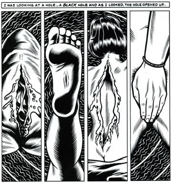
All right comics newbs, "hold on ter yer butts" (ala Samuel L.Jackson in "Jurassic Park")because Charles Burns' "Black Hole"is a whole lotta' weird. This, in my limited experience, is one of the weirdest, coolest, most disturbing comics I've read. Essentially "Black Hole" is about a group of teenagers in a non-descript American town growing up in the seventies. "The Bug", a sexually transmitted disease has descended on the town's teenagers, and only teenagers.The disease manifests itself as a series of mutations, some horribly visible others concealable, that once appear can't be cured.The story that follows is a decent into a world twisted by drugs, alienation, hunger, filth, murder, and a search for redemption and escape.
Burns has a truly remarkable drawing style. His high contrast black and white panels and fine line detail create really intense panel sequences.It's impossible to ignore the images because of their clarity and detail, the contrast sucking you in (especially the panels that are overwhelming black with fine white lines) as the images move from panel to panel. When it comes to depicting the mutations, Burns grotesque drawings are done so well I can't help but linger over them in sick fascination. Everything about this book is done so well, so beautifully that it makes the content and meaning all the more impactful and disturbing.
Overarchingly I think "Black Hole" is a riff on the many sides and disturbing aspects of adolescence. "The Bug" acts as a way of alienating, or more abstractly, physically manifests the alienation many teenagers feel in adolescence. Many of the "mutants" that hang out in the woods were the "nerds", "fatties", or "outsiders" at the local high school. It's ironic that almost all of their mutations are blatant, impossible to hide. Two of the main characters of the novel, Chris and her love interest Rob, both attractive and popular, have mutations that are easy to hide but reveal deeper problems such as addictions and trouble at home. In essence I feel that Burns is using the mutations to show how every type of person, whether unpopular or popular, has some issue or part of them that makes them feel completely alone, alienated, ugly, or unrelatable in adolescence. Making "the bug" an STD was also a calculated decision on Burns part. Sex is obviously something society considers an adult act, although a lot of adolescents willingly or unwillingly participate in this "grown-up ritual". Most teens who have sex have gone through puberty, a mutation in itself, and find themselves on this weird plane of existence, on the cusp of adulthood but already far away from childhood. Along with this idea, I also think Burns' decision to set this story in the seventies was an important choice. Historically the seventies was a "lost era". The nation's youth were becoming more and more disenchanted with the war, Nixon's election, and politics. More generally, the enthusiasm and hope of the sixties counter-culture gave way to an over riding sense of hopelessness and the era became categorized by the many forms of escapism sought by adolescents and adults alike, sex and drugs (which are a huge part of "Black Hole") topping the list.
These decisions by Burns, the STD, the seventies, the mutations, all combine to paint a fearful, but ultimately realistic (all-be-it a bit over dramatic, fanciful portrait)portrait of adolescence. The mutations physically manifest the problems and isolation felt by teens. "The Bug", being an STD, is an example of how adolescent impulsive behaviors can often have devastating consequences because many teen's are given no advice or direction in how to deal with these urges or desires. The seventies and the copious drug use in the text exemplifies the urge to escape many teens feel. I don't want to ruin the end of the book, but there is redemption for some of the characters by escaping their situations, but for others, like many teens, the world and the misunderstanding and isolation of adolescences is too much. Burn's has effectively created a unique, compelling, and disturbing view of a moment we all experience.
Until next time,
GN
Sunday, November 15, 2009
Pulling back the covers, and crawling underneath-Craig Thompson's "Blankets"
Craig Thompson's "Blankets"
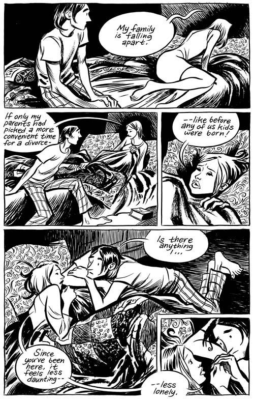
I've already mentioned "Blankets" in this blog, so this blog may be shorter than most, but after discussing it with my Graphic Narrative course I am continuing to be amazed by the things this book is able to do. I think this is, by far, one of the most accessible, best introductions to, graphic novels. The story is relatable for most people; first love, family relations, finding/losing faith, adolescence, but it also gives the reader enough information, style, and room to work on a more metaphorical level that graphic novels/narratives are great at doing. First things first, the art in this book is exquisite. The art is done with a watercolor brush which gives it all a smooth, graceful line. The intricacy of some of his panels completely blow me away, the detail within detail within detail (especially when showing Raina) seems impossible when you consider he worked with a paintbrush (yes, a small paintbrush, but) instead of a fine point pen. In general "Blankets" leaves you with a sense of peace, silence, contemplation, and, in general, (this may be a strong word but I'm going for it) a sense of gorgeousness.
"Blankets." Why that title? This book tackles so many aspects of growing up. Individually, Craig Thompson's experience but also aspects of adolescence we all experience. But what does "Blankets" have to do with that. More than first love, more than loosing one's faith, according to Thompson this novel is an attempt to describe what it is like/feels like to sleep next to someone. This blew me away! Ha, I'm not sure I've ever read a novel of any sort that is bent on embodying such a basic human experience. And we aren't talking sleeping with your lover for the first time, no. In fact, more important than Thompson's relationship with his first love, Raina, is his relationship with his little brother Phil. Thompson is constantly juxtaposing moments spent with Raina with recollections of his and Phil's boyhood spent sharing a bed. More than anything, Craig's relationship with Raina seems to be an attempt to claim a relationship for himself, on his own terms.
Phil's relationship with Craig is more complex because, as I think all siblings experience, Craig must deal with growing up and growing apart from the only other person in the world who might understand what it is and was to grow up as "Craig Thompson". On a more artistic/technical aspect, Thompson's constant use of snow, weather talking about it or drawing sequences that take place in snow, give you the feeling of being covered, of being surrounded and safe.
Until next time,
GN
Tuesday, November 10, 2009
I Hate Life or How I learned not to Eat Shit and Die- Daniel Clowes "Ghost World"
Daniel Clowes- "Ghost World"
"Ghost World" is one of the few graphic novels where I enjoyed the movie more than the novel. Well, I suppose more accurately, I "enjoyed" the movie more than the graphic novel, but it is the graphic novel that does the best job of revealing a more honest depiction of that awful time between adolescence and adulthood. "Ghost World", the graphic novel, also did what all good texts should do (I believe), it laid me out on the metaphorical couch and made me come to terms with some of my own experiences as an adolescent.
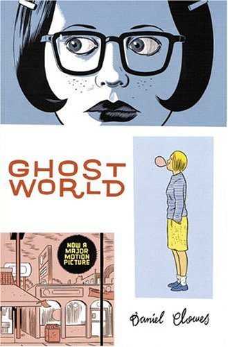
David Clowes is considered to be a pioneer when it comes to the depiction of adolescence in the medium of comics, especially the gloomy, depressing, and dark type of adolescence (is there any other kind?). In fact, this text doesn't really give the reader a happy, redemptive moment. The majority of the narrative and drawings reveal these ugly (literally and metaphorically) characters and incredible awkward situations. And if the characters, situations, or narrative doesn't get you then the aquamarine, musty tint of all the panels will. Clowes claims that he used the tint to evoke the color of artificial light of something akin to a flickering television, which is appropriate to the overall theme of the graphic novel (which we will get to), but I think it also gives it this sickly, annoying, and almost aged/decaying feel to whole work.
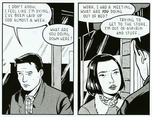
In a nutshell, "Ghost World" follows longtime friends Enid and Rebecca as they face the uncertain future of life after high school and the fast approaching end of adolescence. Enid is constantly changing her appearance, is loud, and generally gives off the vibe that she is constantly searching for attention. Rebecca, while the quieter of the two, is no less annoying in her inability to show much in the way of emotion, constant blase attitude, and follower like role. Ostensibly, Rebecca and Enid are constantly bitching, making fun of, and just being annoying teenagers. But after reading the text it becomes clear that Clowes is being brutally honest about the moment we all realize we can't be kids any more but we don't know what we are suppose to be or do. We are content to just sit in front of the television and "not do" or "not think about" anything for a while longer.You so badly want everything to turn around for Rebecca and, especially, for Enid. You want them to get into a good college, get out of town, grow in some overly ambitious, positive way. You desire the fairy tale ending for both, for them to be redeemed in your eyes.
Dear readers, it never happens.
And perhaps that is why "Ghost World" is terribly tragic and terribly honest.
I mean, is there a redeemable aspect of adolescence. Sure, we can all make up a bullshit answer that it is a time of GROWTH! EDUCATION! EXPRESSION! But let's be honest, we are all lost in some small (or large) way in our own awkwardness and inability to come to terms with the very high, adult expectations giving to us. The way in which Enid and Rebecca bitch and make fun of people reminded me, shamefully, of something my friends and I did almost on a weekly basis. It was ritual, as it seems to be in most small towns with nothing to do, to go to the 24 hour diner and drink coffee, smoke clove cigarettes, and be incredibly loud and obnoxious. At our particular location, every night an old man would come in around midnight or so. He was missing most of his lower jaw, his face horribly disformed probably from some sort of cancer. We would make endless fun of this poor old man, never to his face but all the same we all knew how mean and awful it was. And yet we did it. I look back, still filled with so much shame and try to ration why we did what we did. I think some of it was out of pure meanness, but I think a lot of it also came from fear, and our own insecurities.
The character of Enid is vital to my understanding of both my own moment of shame and, more generally the novel and perhaps adolescence itself. (*Disclaimer* if you haven't read the novel skip this paragraph) In the end Enid doesn't get into the school she wants to and Rebecca and her have grown apart for a number of reasons (boys among them). Yet, the novel ends with Enid going to a bus stop (that apparently has been defunct for a number of years) and being picked up by the bus and traveling away from her small town. In Enid, the reader understands that one doesn't merely grow out of adolescence, one has to (sometimes painfully) shed the protective comfortable skin of childhood and teenage years and jump blindly into the unknown of adulthood. In Enid we see the adolescent longing for authenticity, for an adult world. When it becomes apparent how fake the adult world is and how futile holding out for some form of authentic, honest adult life is, Enid has to take a plunge she may not be ready or really willing to take. That's where the novel ends, we will never know if she made sense of it all. But isn't that a truth as well?
The movie, released in 2001 and directed by Terry Zwigoff, is more of a variation on a theme than a true rendering of the graphic novel. Without going into too much detail, characters are added, a love story (of course there is a love story, it's a movie what did you expect?)that isn't in the book, and, disappointingly, Enid and Rebecca's friendship is downplayed. When Enid leaves town at the end, whether because of the changes from graphic novel to movie or something else, we are cheering her as opposed to honestly accepting her leaving as a terrifying try at leaving behind adolescence.
The movie's great on its own, but the book is more important in its ability to force a critical eye on your adolescent self.
You still with me reader? I hope so. Don't worry, happier times (fingers crossed) are ahead.
Until next time,
GN
Thursday, November 5, 2009
Ceci n'est pas une pipe: Paul Auster's "City of Glass"
Paul Auster's "City of Glass" adapted by Paul Karasik and David Mazzucchelli
If you are new to the graphic medium, as I am, "City of Glass" is one of those narratives that will change the way you think of comics. I even think fanboys and true believers are a bit thrown by Mazzucchelli and Karsik's genius interpretation of the classic post modernist anti-detective story. "City of Glass" was originally published in 1985, the first novel in Auster's New York Trilogy. I've only read a few chapters from the original novel, but I feel that Mazzucchelli and Karsik have given a perfect visual form to the absurd, terrifying, and down right (pardon me) "mind-fucked" narrative of Auster's original novel.
"City of Glass" follows mystery writer Daniel Quinn who is mistaken for a detective named Paul Auster (trippy I know) by a man who is afraid his father will kill him when he is released from prison. To try and explain much further would be futile, the only way to truly experience this work is to read it.
The first thing I noticed was M&K (Mazzucchelli and Karasik) using a type of panel transition called "non-sequiter". This type of panel transition combines an unrelated series of images and situations to further the visual and textual narrative. M&K's use of this series of transitions is the beginning of a post-modern "romp" into how to represent the broken, psychotic, and chaotic culture of Quinn's existence in "City of Glass" and, arguably, our own modern existence. Quinn's character is a guy who likes to be lost. He enjoys getting lost in the city and in his very head. It is ironic then, that his novels fixate on a character (Max Work) who solves crimes and rationally orders things. As Quinn slowly losses his mind, as he becomes more fixated and obsessed with his mission to understand and protect his client, the visual and textual aspects of the narrative become more abstract and formless. By the end of the narrative we see the typical six to nine panel sequence collapse into scattered frames and gutters, until they disappear altogether. In fact, in order to understand and make sense of the text it is necessary to follow the overarching "feeling" and "tone" of the story as opposed to the actually story line. Throughout the story is connected by the aforementioned sense of obsessiveness maintained by Quinn throughout the case and, perhaps more strongly and importantly, the sense of chasing after a lost cause.
If there is any character from the literary cannon that Quinn identifies with it is Cervantes' Don Quixote. Like Quixote (p.s. look at those initials!!!!) Quinn wants a way out of the boredom, misery, and senselessness that is his life. And like Quixote, it can be argued, that Quinn crafts meaning and order to his life by obsessing over the case in much the same way that Quixote chases his windmills. Other than seeking out meaning and identity in a chaotic existence, this graphic novel takes on the idea of a prelapsarian language (think language before tower of Babel), how we view images and connect them to meanings ("Ceci n'est pas une pipe") and a whole host of other ideas like these that I have not grasped or identified fully.
If there is one bit of advise I can offer the new reader taking on "City of Glass" it is a quote from Auster himself "...Much later he would conclude that nothing was real except chance" (p.2). Perhaps it is safer to say that we shouldn't assume meaning, that we should let this graphic narrative just be. Maybe, more importantly, we too should loose ourselves in this chaotic existence.
Perhaps there is no order.
Until next time,
GN
Sunday, November 1, 2009
Touching the Fictional Nerve: Adrian Tomine's "Sleepwalk and Other Stories"
"Sleepwalk" is the most modern graphic fiction we have come up against in class. I'd encountered Tomine's work before in his graphic novel "Shortcomings". That story was about a socially awkward, indie-alt guy's relationship with a girl. In the same vein, this collection of stories follows various socially awkward guys and girls through relationships, beatings, voyeurism, and other assorted plot lines. What seems to connect Tomine's stories throughout is the way in which each story is unnerving, some more than others. The most overtly disturbing is "Pink Frosting". In twelve panels Tomine shows how one man's day goes from great to horrible, ending with the protagonist "biting the curb" (if you've seen "American History X" you know how disturbing this is). Others are more subtle, yet no less disturbing. Perhaps one that best typifies Tomine's incredible style of combining art and story in the most concentrated effective way is "Drop". In just four panels we learn of how a man accidentally dies by falling off the side of a reservoir while trying to change a tire. The darkly inked four panels only show the man in silhouette, we never get to see his face only his hand reaching towards nothingness as he falls "backwards through the darkness, filled with disbelief". Tomine's characters are quirky, some suffering from debilitating relationship issues as in "Sleepwalk" or the social awkwardness of being a teenager as in "Dylan & Donovan". Other than being quirky, all of his characters can be characterized as being "outsiders", people who by choice or no choice exist at the fringes of our society. My personal favorite from this collection is "The Connecting Thread". More text heavy then most of the stories in "Sleepwalk", "The Connecting Thread" follows a woman as she slowly realizes that a series of "I Saw You..." ads in the paper are about her. In the first panel we see her seated by the door of a coffee shop. It becomes clear she desires attention. She is at first excited and nervous about the possibility that someone may be enamored of her. But when the person who is supposed to have written the ads never makes him/herself known, and the ads continue to be printed each week, each time more personal, increasingly more stalkerish, the woman becomes terrified. At the end Tomine writes "Finally, not knowing what else to do, Cheryl stopped looking at the personals, and that week, the ads about her stopped appearing". Were there really ever any ads about her, did she make them up, is it true, is it fake? In true Alfred Hitchcock style Tomine leaves us spooked and intrigued, our minds twisted up in the plausibility and implausibility of each situation. Each story, in some way, leaves you lingering (in a good way), mulling over the plot line and outcome of the story. I suppose what makes Tomine so intriguing is that each story is accessible to the reader, even the more extreme ones like "Pink Frosting" are, in reality, perfectly plausible in our reality.
Until next time,
GN
Until next time,
GN
Subscribe to:
Posts (Atom)