Curious.
Beautiful.
Strange.
Frustrating.
Compelling.
These words only begin to describe Ware's graphic novel "Jimmy Corrigan: Smartest Kid on Earth."

The first thing I noticed about "Corrigan" was the way the thick, horizontal text sat in my hands. It felt different. The cover design for the paperback was beautiful and intricate, but very unlike most of the comics I've encountered up to this one. In fact Chris Ware noted that it's shape and size are similar to that of his estranged father's urn (more on that later).
(A Note: If you buy the paperback version of this text, as opposed to the hardcover, be prepared to have your copy fall apart within two or three readings. The binding, whether because of the dimensions or the number of pages, will fall apart on you. I recommend, if you want to keep this book for any amount of time, you fork over the extra cash for the hardcover)

Opening the cover I was greeted by this imposing, complex mass of really, really small text, a diagram of a cat and mouse, and an exam, a multiple choice exam to be exact. What is the purpose of these initial pages...why to help you figure out how to encounter and read "Jimmy Corrigan."
Yeah, directions on how to read it.
What follows is an incredibly frustrating, but ultimately rewarding journey into the shambles of a life of Chicagoan Jimmy Corrigan as he meets his father for the first time. The text is complicated by multiple plot lines involving Corrigan's family ancestors and how they were unfit or absent fathers.
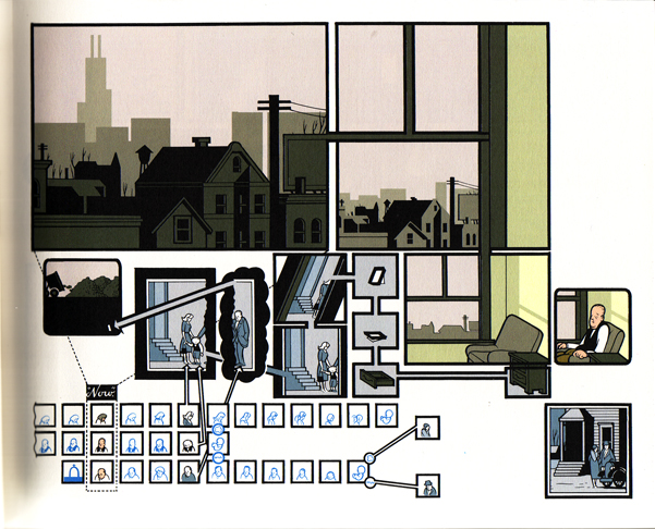
"Corrigan" looks like it could be a graphic design manual as well as be a graphic narrative. It's often difficult to know which way panel sequences should be read (Ware often includes arrows to direct readers) and the incredible amount of small detail and sometimes smaller text can leave the reader frustrated. But I found when you gave up trying to asses meaning to every small part, even gave up on reading or dissecting some of the diagrams or impossible to read text, that was when "Jimmy Corrigan" began to make sense. Ware has created a graphic narrative that is not so much about the story but about the mood. Its complex nature is representative of a family's confusing existence. This is also an increasingly silent text. There are a majority of panel and panel sequences without text, but the silence is so fitting. It works to make us uncomfortable, which helps us to relate to and understand the main character Jimmy Corrigan, and it also helps us to understand the importance and detrimental affect of over a century of silent father/son relationships.Another characteristic of Ware's design in "Corrigan" are large empty spaces in panels. These negative spaces act as well to represent the empty, negative space all the Corrigan men live in.

What is "Jimmy Corrigan"? Is it a meditation on the failure of the modern father? It certainty could be considering during it's creation Ware was surprised to hear from his own estranged father (interestingly enough the amount of time it takes the reader to read "Corrigan" is supposed to be how much time Ware spent with his own father). Could "Corrigan" be focusing on the limited real contact we have with people, how loneliness can seep into our lives even before we are born? This is all possible I think. But what I think is most crucial about "Jimmy Corrigan" is its ability to make you think about your own family and family history and consider what your relationship to these larger "ideas" or actual "things" are.
How appropriate this week is Thanksgiving.
I hope all of you out there (you are out there right?) have a great Turkey or Soy Substitute Turkey Day, and don't forget about little "Jimmy Corrigan" when your Grandpa is telling you for the millionth time about his recent prostate problems. You could only be so lucky.....
Until next time,
GN

No comments:
Post a Comment